Heath Schreiweis
Designer

Follow Me

Portfolio

Cairns and Hinterland Hospital and Health Service

  • Client: Cairns Hospital
  • Tags: Branding, Government
  • Date: 20 October 2021
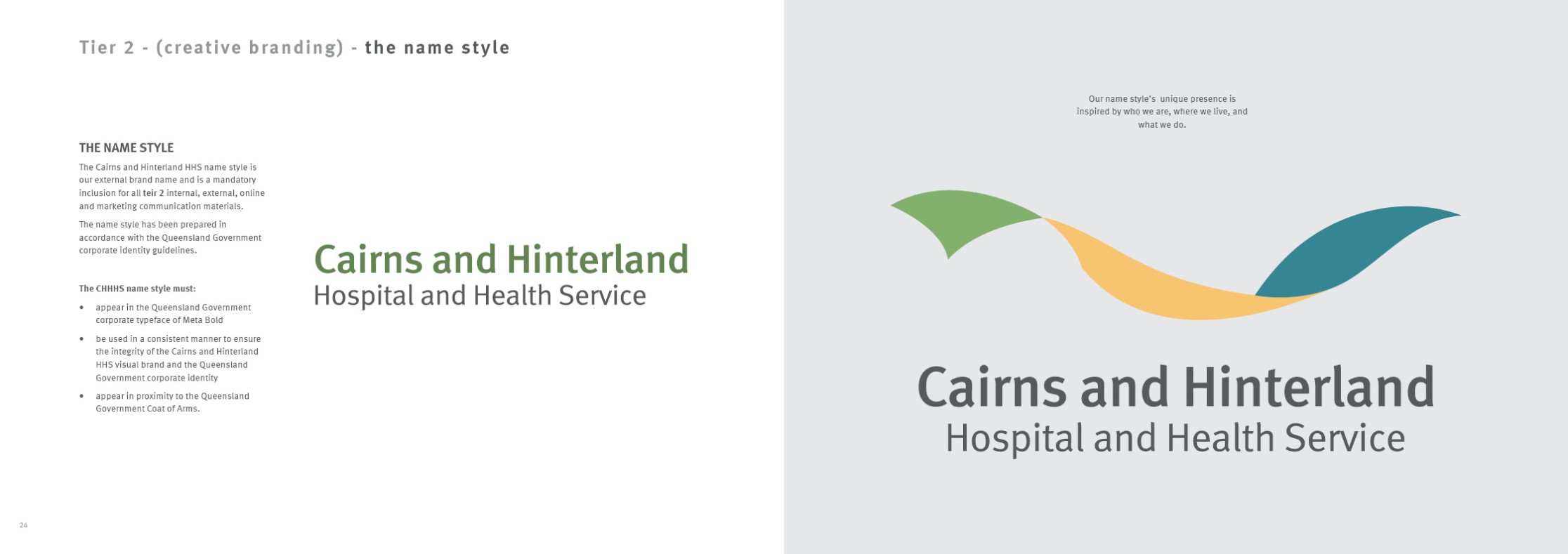
Cairns and Hinterland Hospital and Health Service
Image

Our Branding Tale

This brand identity represents hundreds of hours of work, and the input of over 1,000 staff and community of the Cairns and Hinterland HHS.

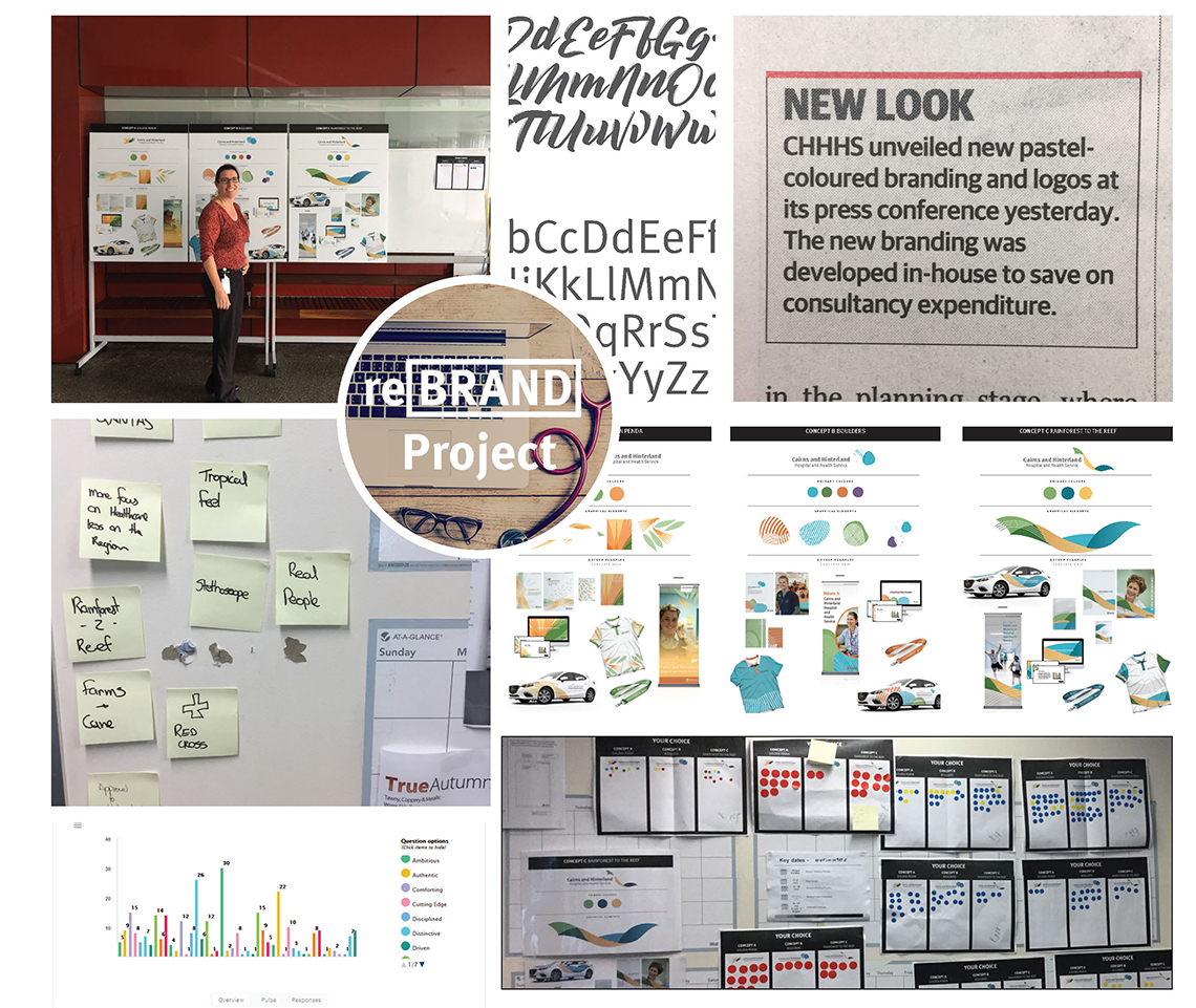
In early 2018 the communications and engagement team started a 6-month journey to create a unique and identifying brand that captured the health service, its values, community and region.

It was important to develop a brand that was embraced by the staff and community and the best way to do this was to incorporate staff and community input during the whole process.
After an initial conceptual survey of our staff and community, we determined five primary keywords that allowed us to create a direction with our brand: Efficient, Friendly, Integrity
Passionate, Reliable

Image
Image
Image

Additionally it was clear that the community and staff strongly identify with the region and they wanted a brand that illustrated the picturesque landscape and lifestyle that comes with far north Queensland. There were strong elements of compassion, wanting to help patients, make them feel comfortable and create a quality patient experience when at one our facilities.

This reinforced the shared values of the Health Service - compassion, integrity, respect and accountability - which where also developed through staff and community consultation. These themes needed to be reflected in the colours, photography and style of the brand.

From these results, three brand concepts where developed and voting commenced. To ensure a good cross-section of staff and community participation, voting occurred in person, social media, public displays and visits to regional facilities and attending various staff meetings and committees.

The result was over 1,000 votes from staff and community and the results were incredibly close.
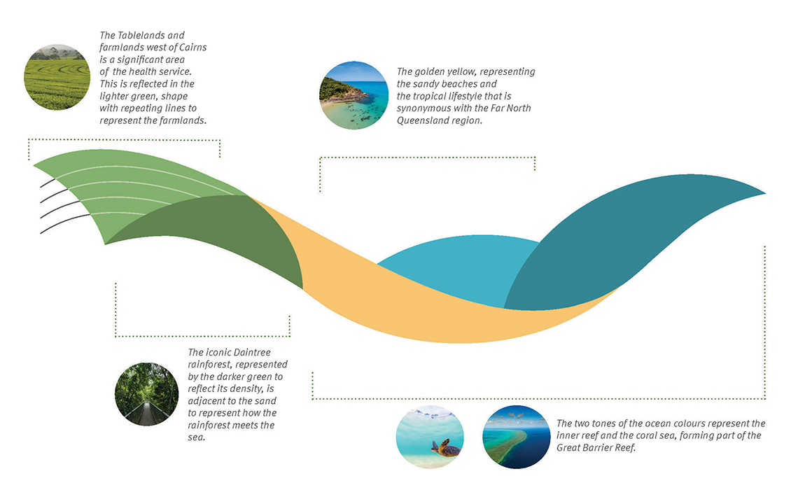
In August 2018, the Cairns and Hinterland Hospital and Health Board signed off the staff and communities’ preferred brand “rainforest to the reef” to represent the Cairns and Hinterland HHS.

Image

Colour

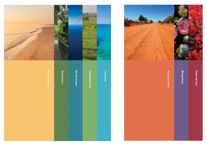
Our colour palette is derived from our unique environment and heritage.
Our palette avoids the use of garish artificial colours. It is rich without being ostentatious and respectful to our audience and heritage.

Further refinement has been made to ensure the hierarchy of the colour palate is maintained allowing harmonised usage of colours.
Corporate and supporting colours of the brand identity have been devised ensuring stronger identifcation and consistent usage.

Image
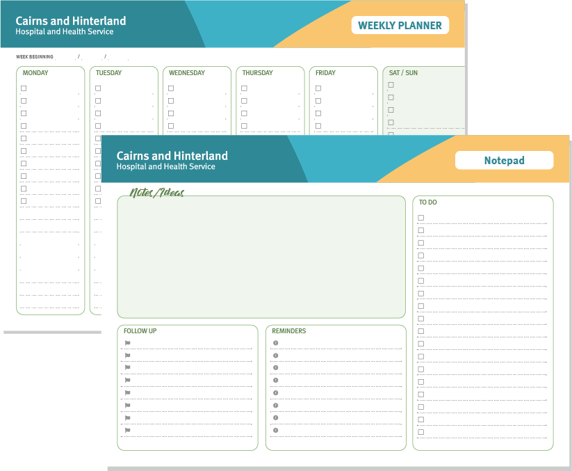
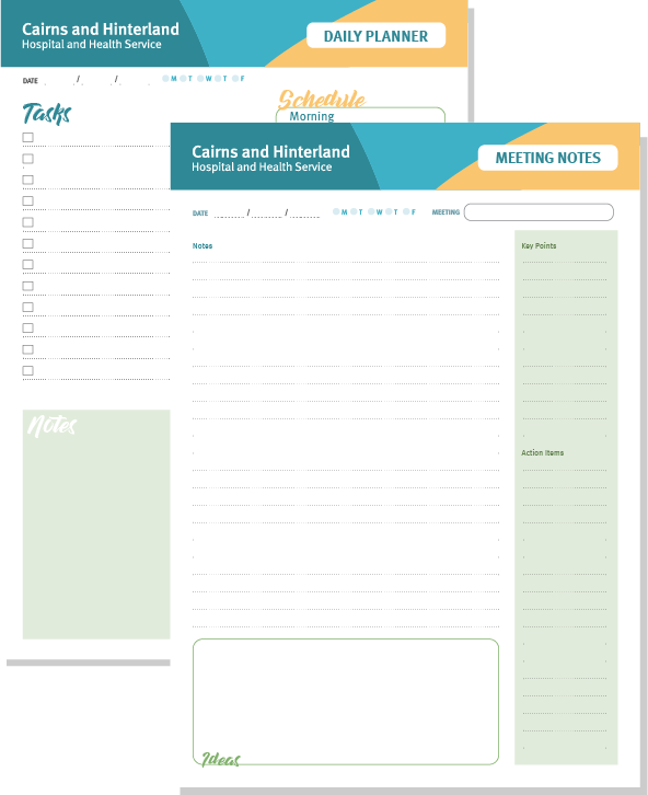
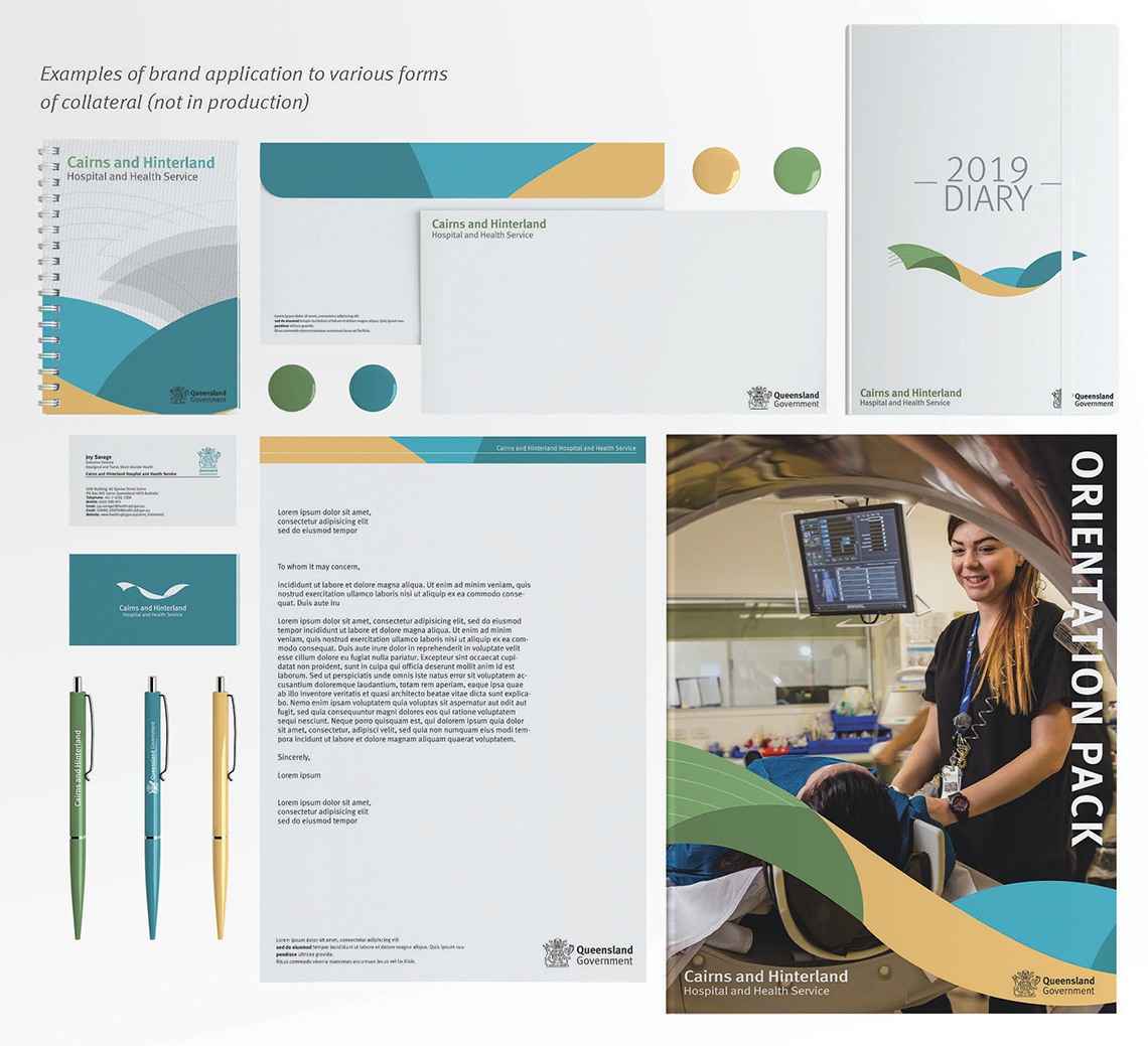
Custom printable stationary designed and available for staff to use in their day to day duties.
Image
Image
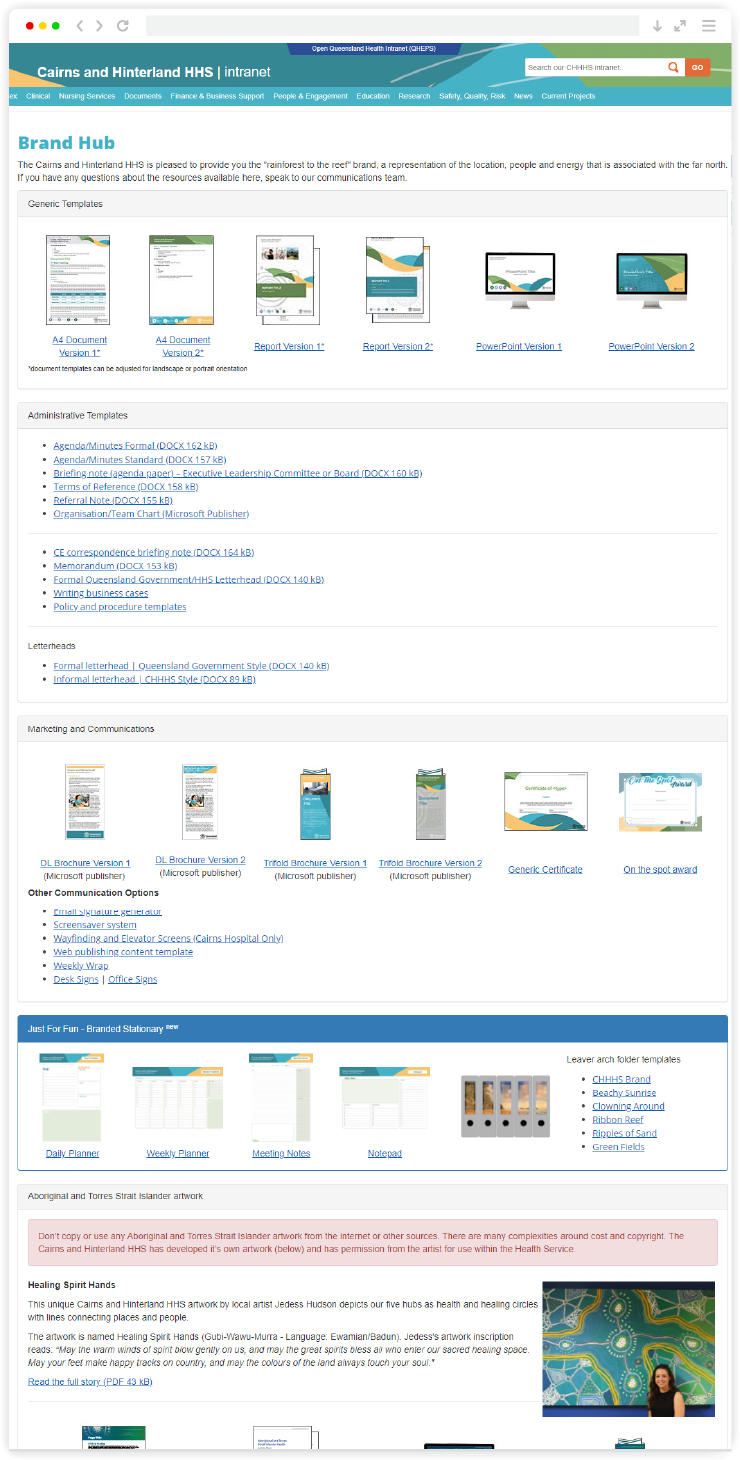
Internal 'Brand Hub' portal with templates, resources, stock images and illustrations that staff can access and use.
Image
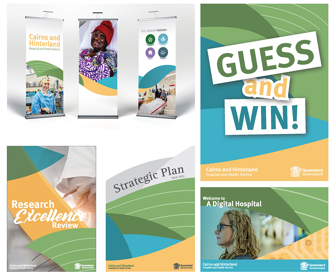
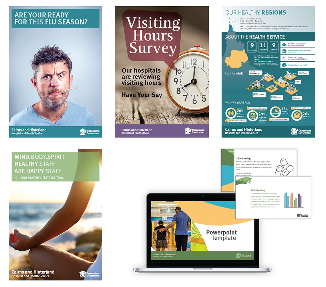
Examples of brand usage
Image
Image
Image

Follow Me

Get In Touch

Contact me about a work opportunities

Copyright © 2020 Heath Design Studio

Search